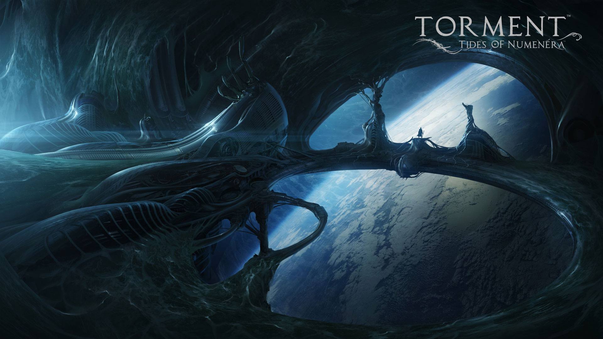
Short Version: It’s a rough and overwhelming start, but it’s get very good over time. If you don’t mind reading a LOOOOOOOT of text, then you’ll love how rich the world building is in this game. Believe me, you’ll learn to love this game, even if the combat suck ass.
Long Version: Despite how much I love fantasy-themed stuff, I’ve never really branched out beyond The Elder Scrolls series and a few select others. Most of all the other fantasy-themed works, be it in video game, written or film form, feel exactly the same to me and don’t do enough to stick out from the rest. Even then, the one thing that really pulls me in about all of them is how they build their worlds. Fantasy themed worlds, at least to me, have been less about the story and more about everything else surrounding it. This is something that Torment: Tides of Numenera does very well, to the point where I would rather read a book about it, rather than play a game, since that’s the part that falls short for me.

Break Out The Stats Sheet
Torment: Tides of Numenera is also playfully known as “the greatest book you’ll ever play.” This is due in part to the overwhelming amount of text that the game presents throughout the whole thing. It can be very overwhelming at first, but soon you’ll realize that it will be the key propelling you forward through the campaign. Literally every little thing that happens in the game is described in massive detail. From someone’s appearance to even the smell of certain rooms, you’ll always have an opportunity to enrich yourself in the great descriptions and almost poetic writing of the text boxes. Because reading is such a massive part of the game, I would’ve appreciated a bigger space to read, or at least bigger text. Since I was playing this on PS4 with a fair distance away from the TV, I always had to hunch over and look closer to be able to read the relatively small text primarily found in the lower third of the screen. Since reading is so important, I wouldn’t have minded an option where I could just have larger text that fills the entire screen.
Speaking of the interface, I did allude to the point that I didn’t really enjoy the more visual parts of this game before, so let me explain. This is mostly due to the generic feeling that I talked about in the beginning. Even though the descriptions for everything are so rich, the actual things that you look at in the environment are a lot less impressive. Because everything is seen from an isometric viewpoint, you can never really get the full picture of what you’re looking at, hence the hyper specific descriptions. Usually, this way of writing is implemented because this was necessary when reading a fantasy book (or any book, for that matter) or playing Dungeons & Dragons, but it also makes sense here. This isn’t a fully 3D rendered first/third-person game like Skyrim or The Witcher, so Torment kind of leans on its text to make up for the relatively boring look of all the NPCs. Graphically, it’s fine; it’s just the art direction that’s not grabbing me.

It’s All In The Mind
One great example was during a time that I had to negotiate with some giant digging creatures underground that needed to move somewhere else, or else the buildings in the surface would sink. Their description was so intriguing, but in the actual game, it just looks like some big grey dude that stands around. I would’ve liked everything that it presented in the text to actually be reflected in the game in some way. It’s kind of like watching a movie where everything is described for you, which is problematic for a visual medium. I’d rather have games like these show rather than tell, but Torment tells everything and shows very little that fits that. Having the audience fill the gaps with their imaginations can leave us disappointed if whatever we have in our minds is a lot more heightened than what’s actually there.
This feeling translated to the menus as well. Whenever you pause to check your objectives, stats or anything else, you are met with a cannonball of information. Every time I come into these menus, I never know where to look because of how cluttered with stuff the menus always are. If you’re on PC, I guess it’s easier to just click on what you want with the mouse, but on PS4, you need to find what button you’re highlighting, then trudge your way to where you need to be. Some options are tied to buttons on the controller, like the touch pad, so it’s difficult to remember all of these things, on top of the menus feeling a little clunky and difficult to use. If this bothers you enough, I suggest going for the PC version, just to facilitate the process through the mouse. You thought Operation Abyss had too much going on in the menus? Think again.

[I originally posted this review on The Buttonsmashers. You can read the rest of the review
by clicking here or just listening to the video version above.]


Game Review – Torment: Tides of Numenera
0Short Version: It’s a rough and overwhelming start, but it’s get very good over time. If you don’t mind reading a LOOOOOOOT of text, then you’ll love how rich the world building is in this game. Believe me, you’ll learn to love this game, even if the combat suck ass.
Long Version: Despite how much I love fantasy-themed stuff, I’ve never really branched out beyond The Elder Scrolls series and a few select others. Most of all the other fantasy-themed works, be it in video game, written or film form, feel exactly the same to me and don’t do enough to stick out from the rest. Even then, the one thing that really pulls me in about all of them is how they build their worlds. Fantasy themed worlds, at least to me, have been less about the story and more about everything else surrounding it. This is something that Torment: Tides of Numenera does very well, to the point where I would rather read a book about it, rather than play a game, since that’s the part that falls short for me.
Break Out The Stats Sheet
Torment: Tides of Numenera is also playfully known as “the greatest book you’ll ever play.” This is due in part to the overwhelming amount of text that the game presents throughout the whole thing. It can be very overwhelming at first, but soon you’ll realize that it will be the key propelling you forward through the campaign. Literally every little thing that happens in the game is described in massive detail. From someone’s appearance to even the smell of certain rooms, you’ll always have an opportunity to enrich yourself in the great descriptions and almost poetic writing of the text boxes. Because reading is such a massive part of the game, I would’ve appreciated a bigger space to read, or at least bigger text. Since I was playing this on PS4 with a fair distance away from the TV, I always had to hunch over and look closer to be able to read the relatively small text primarily found in the lower third of the screen. Since reading is so important, I wouldn’t have minded an option where I could just have larger text that fills the entire screen.
Speaking of the interface, I did allude to the point that I didn’t really enjoy the more visual parts of this game before, so let me explain. This is mostly due to the generic feeling that I talked about in the beginning. Even though the descriptions for everything are so rich, the actual things that you look at in the environment are a lot less impressive. Because everything is seen from an isometric viewpoint, you can never really get the full picture of what you’re looking at, hence the hyper specific descriptions. Usually, this way of writing is implemented because this was necessary when reading a fantasy book (or any book, for that matter) or playing Dungeons & Dragons, but it also makes sense here. This isn’t a fully 3D rendered first/third-person game like Skyrim or The Witcher, so Torment kind of leans on its text to make up for the relatively boring look of all the NPCs. Graphically, it’s fine; it’s just the art direction that’s not grabbing me.
It’s All In The Mind
One great example was during a time that I had to negotiate with some giant digging creatures underground that needed to move somewhere else, or else the buildings in the surface would sink. Their description was so intriguing, but in the actual game, it just looks like some big grey dude that stands around. I would’ve liked everything that it presented in the text to actually be reflected in the game in some way. It’s kind of like watching a movie where everything is described for you, which is problematic for a visual medium. I’d rather have games like these show rather than tell, but Torment tells everything and shows very little that fits that. Having the audience fill the gaps with their imaginations can leave us disappointed if whatever we have in our minds is a lot more heightened than what’s actually there.
This feeling translated to the menus as well. Whenever you pause to check your objectives, stats or anything else, you are met with a cannonball of information. Every time I come into these menus, I never know where to look because of how cluttered with stuff the menus always are. If you’re on PC, I guess it’s easier to just click on what you want with the mouse, but on PS4, you need to find what button you’re highlighting, then trudge your way to where you need to be. Some options are tied to buttons on the controller, like the touch pad, so it’s difficult to remember all of these things, on top of the menus feeling a little clunky and difficult to use. If this bothers you enough, I suggest going for the PC version, just to facilitate the process through the mouse. You thought Operation Abyss had too much going on in the menus? Think again.

[I originally posted this review on The Buttonsmashers. You can read the rest of the review by clicking here or just listening to the video version above.]Game Review – Birthdays the Beginning
Game Review – The Legend of Heroes: Trails in the Sky the 3rd