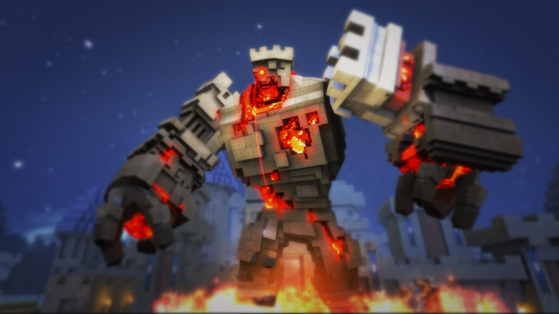
Short Version: I like it! I only wish it had more than 3 levels, a handful of enemies and 4 weapons. It’s a very simple and cheap-looking shooting gallery, but it feels good and surprisingly comfortable to play in virtual reality. I would’ve loved it if it had more content and variety, but for 10 bucks, you can definitely do a lot worse.
Long Version: I always appreciate a virtual reality game that’s easy to play on my desk. I know that most of the appeal of VR is having a play space where you can stand up and interact with a virtual environment, but sometimes I don’t wish to do that. There is a lot to be enjoyed about games where you can sit comfortably and play something simple in VR, with a few examples being Thumper and even the Hatsune Miku: VR Future Live concert experience. I would place Pixel Gear in a similar category, since this is probably one of the most comfortable and less-cumbersome games I’ve played on PlayStation VR. It is kind of unfortunate that this game has about the same amount of content and depth as an Atari 2600 game.

Shooting Gallery
Pixel Gear is a virtual reality shooting gallery game brought to you by the same people that gave us the archery game Ace Banana during the PSVR’s launch. However, unlike Ace Banana, this game has no story. You simply start the game by choosing your difficulty, choosing a level and you’ll find yourself shooting enemies in no time. I appreciate that they let the players get to point and start playing without anything getting in the way, but everything from the opening menu to the levels and music feel incredibly cheap and empty, both literally and figuratively.
I’m usually not the kind of person to fuss about graphics, but I definitely insist on the art direction, for I think that is more important than obsessing over how realistic something looks or how high the frame rate can get. With that said, I think this game looks terrible. First off, everything has that Minecraft-style blocky look to it, and there’s nothing wrong with that, but it has that exact same feel that those slapped together Early Access games on Steam have. All of the enemies, sound effects and environments look like they were taken straight out of some sort of game creation software like Unity, where they found some free assets and templates to use, but never expanded or improved upon it.
![]()


