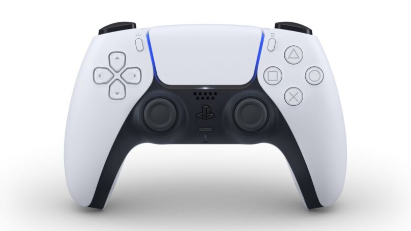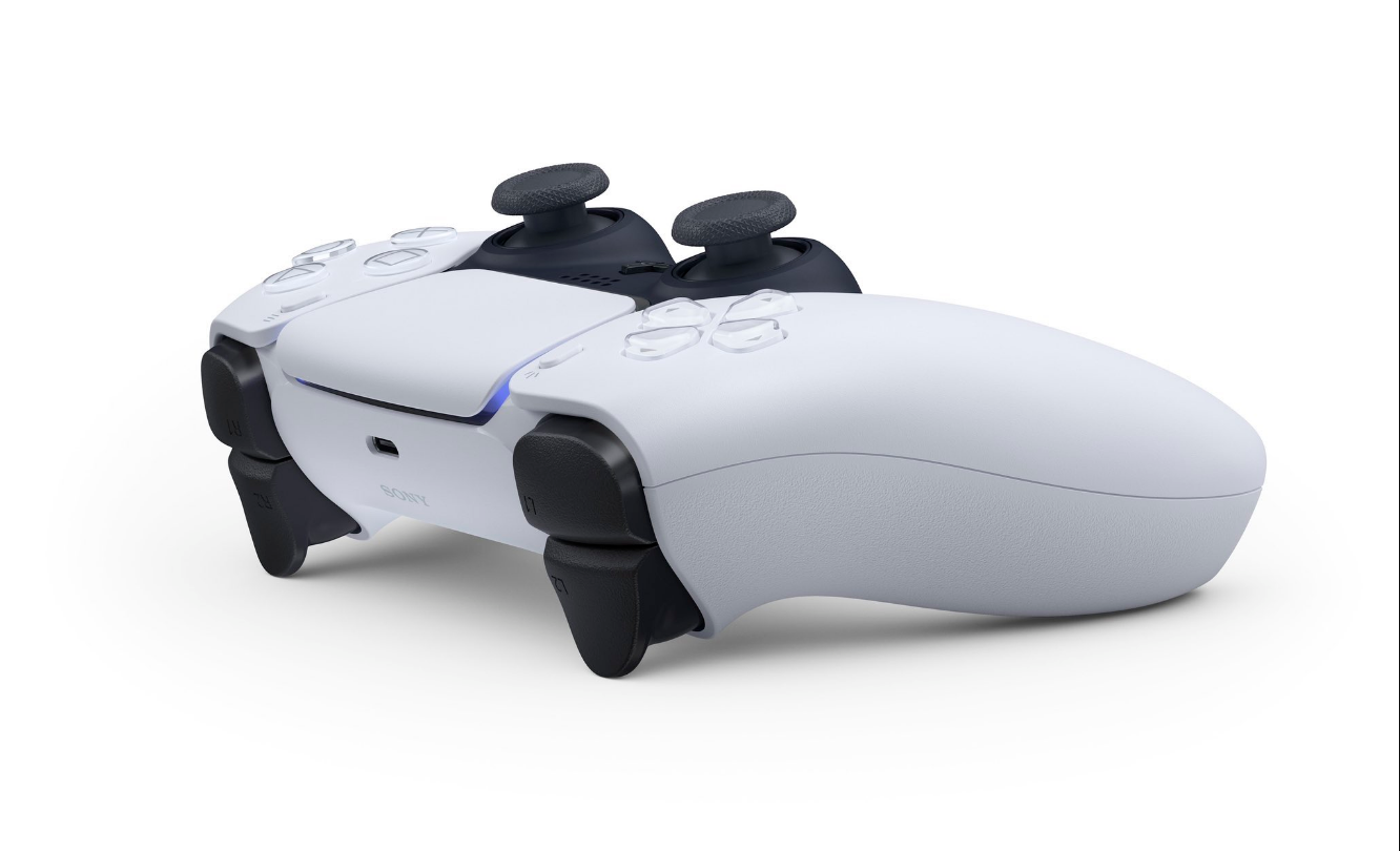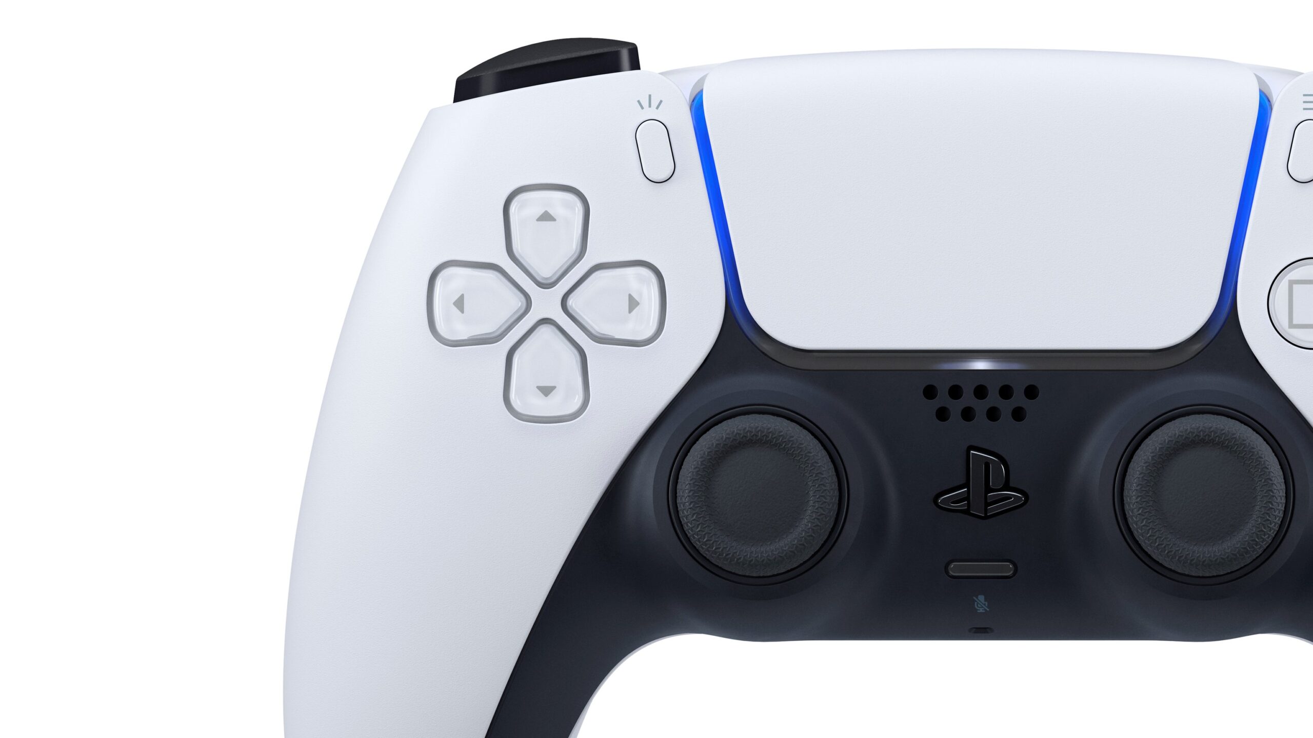

Seemingly out of nowhere, Sony has just revealed their newest design for the PlayStation 5’s controller, which honestly looks like it was made out of a Star Wars Stormtrooper’s helmet or something. I like it a lot! It has a very futuristic feel to it, and the features are nothing to scoff at either. Take a look at what it’s got, via the official PlayStation Blog:
- USB-C (Finally!)
- The light bar is now surrounding the touch pad.
- The “Share” button is now a “Create” button.
- Haptic feedback
- Built-in microphone
- It has a slightly different build, similar to a Switch Pro controller.
- The D-Pad is very similar to that of the PS Vita (Which means it will be PERFECT for fighting games!)
There is only one white and black color shown, but it’s pretty obvious that there will be other styles coming out in the future.

I gotta say, as someone who loves the PS2/PS3 controllers, and also as someone who uses the Switch Pro controller for everything, this new DualSense controller is badass. It’s just as much of a technical refresher as it is a visual one. I really want to know how it feels to actually hold it in your hand and use it. Some people have complained that they want the analog stick placement to be more akin to the Xbox and Switch, but I personally have never had any problems with this layout. It has also never been bothersome for me to change from one controller to the other because of it. If anything, it’s the face button placements that always give me a hard time, but I digress.
Feel free to read more on the new controller on the PlayStation Blog.
Now all that’s left is to see what the console looks like. Based on the controller’s look, we might actually have a good hint of it’s appearance.
Source: PlayStation Blog, and a TON of people of Twitter


